Introduction
Microsoft Windows 8 apps have a distinct design, style, and set of standards that differ from traditional desktop applications. In designing Windows Store apps, it will be helpful to understand the design influences and user interface (UI) standards. It is always a good idea to incorporate UI standards that make an app intuitive and easy to use and provide a consistent look and feel.
This lesson will clarify design terminology, present design philosophies that influenced the Windows 8 UI style, and provide considerations for app design. These considerations will be focused on designing for touch, designing for different form factors and different states, and maintaining the standard design guidelines. Because the Windows Store is the primary avenue, if not essentially the only avenue, for distributing your Windows 8 apps, it is important to adhere to user interface design and standards. Failure to adhere to design criteria will result in an app not being accepted to list in the Windows Store. For instance, if an app utilizes a touch gesture in a way that differs from how Windows uses the gesture, it will not be accepted into the Windows Store.
Microsoft wants to maintain a very distinct style with Windows 8 apps. The style finds its roots in the German Bauhaus school of architecture and design, dating back a couple of decades before World War II, and the International Typographic Style that came out of Switzerland in the 1950s. Naturally, this is also referred to as Swiss design. Microsoft originally referred to the style as the Metro design language.
- Explain the style principles of Bauhaus and Swiss design principles and how they are incorporated into the Windows 8 UI.
- Demonstrate the different touch gestures utilized in Windows 8.
- Evaluate how well an app conforms to the Microsoft Windows 8 design guidelines.
- Windows 8 User Interface – Design Influences
- Design for Touch First
- Accommodating Different Form Factors
- More Design Considerations
- Swiss Graphic Design History A collection of examples
- "Lessons from Swiss Style Graphical Design"
- "Bauhaus: Ninety Years of Inspiration"
- "Bauhaus: Design in a Nutshell" (2:23)
- Swissted
- "APP:207: Windows UI Design" (57:28)
- "APP202: The Absolute Beginner's Guide To Building Windows 8 Apps" (1:01:28)
- Watch the first 24 minutes of movie.
- "Touch interaction"
- "Quickstart: Touch input from Windows Store apps using C#/VB/C++ and XAML"
- "Guidelines for window sizes and scaling to screens (Windows Store apps)"(Note: These guidelines are for Windows 8.1, which is slightly different that the 8.0 guidelines used in this lesson.)
- "Guidelines for resizing windows to tall and narrow layouts"
- "Guidelines for app bars (Windows Store apps)"
- Quiz
- Assignment 2A: Design Philosophy Presentation
- Assignment 2B: Touch Gestures Poster
- Assignment 2C: Evaluate the Design of Existing Apps
Instruction
Windows 8 User Interface – Design Influences
Clarification of UI Terms: Metro, Modern, and Windows 8
While Microsoft was busy creating programming languages such as VB.NET and C#, they were also developing a design language (or user interface style) that they initially referred to as "Metro" style. While the Metro style had its roots long before Windows 8, the style began getting significant attention among developers as Microsoft began unveiling Visual Studio 2012 along with glimpses of Windows 8. The style is the core of all of Microsoft's consumer offerings, including the Xbox 360 gaming system.The threat of a lawsuit by the German retailer Metro AG (a.k.a Metro Group) caused Microsoft to briefly rename the design language "Modern UI" and the products built for the user interface as "Modern UI Apps". But in the fall of 2012, Microsoft once again renamed the style "Windows 8 UI" or "Microsoft design language" and the apps "Windows 8 apps" or "Windows Store apps". You now know that any of these terms in programing or user interface design language all refer to the same design guidelines.
The Bauhaus Influence
Staatliches Bauhaus was a school of architecture and design operated at three different locations in Germany between World Wars I and II and was founded by Walter Gropius. It was very influential in the modernist art movement. The Nazi regime shut the school down and many of the architects and artists moved to Israel, the United States, Canada, and Western Europe both before and after World War II. Tel Aviv is home to the Bauhaus Museum and there are over 4,000 buildings in Tel Aviv designed with Bauhaus concepts. The prevalence of stark white, minimalist designed buildings has earned Tel Aviv the nickname of the "The White City".

Figure 1 – The Bauhaus school in Dressen, Germany
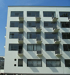
Figure 2 – A dormitory building at the Bauhaus school in Dressen, Germany. Compare this to the Windows 8 Start Screen.
The Bauhaus style incorporates very clear lines, geometric shapes (especially rectangle), and symmetry. It supports minimalism and emphasizes the principle of "form follows function", or that the shape of a building or object should be designed around its intended function or purpose. Bauhaus and its subsequent spinoffs followed the "less is more" approach to design, and that is a hallmark of the Windows 8 UI design style.

Figure 3 – The Bauhaus Museum in Tel Aviv, 2008.

Figure 4 – The White Building on Ben Yehuda Street in Tel Aviv, 2008.
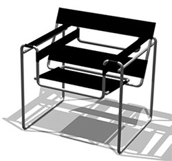
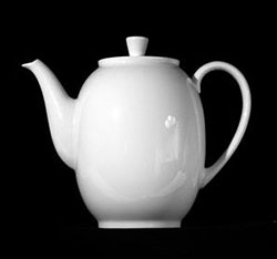
Figure 5 – Bauhaus design principles were also implemented in modern furniture, kitchen appliances, and graphic design. Marcel Breuer's Wassily Chair incorporates Bauhaus design principles (left) as does the pitcher designed by Dr. Hermann Gretsch (right).
The Swiss Design Influence
The Bauhaus art movement fed into the typographic design styles of the Swiss design movement of the 1950s, which is also referred to as International Typographic Style. An emphasis was placed on type as a design element with emphasis on readability, openness, cleanness, and minimalism, and negative space. Sans serif fonts took hold as part of this movement, with Helvetica becoming a popular choice. Left justified (ragged right) text alignment also grew out of the Swiss design. It also emphasized photography over illustrations. Swiss design also incorporates grids for structure.
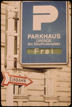
Figure 6 – Signs at the Beethoven Park Garage in Austria show the influence of Swiss design.
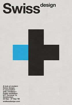

Figure 7 – Two posters by graphic designer J. Kleyn.
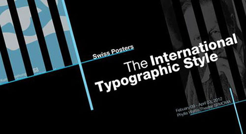
Figure 8 – Another Swiss Design poster.

Figure 9 – A Swiss design layout utilizing simple typography as a design element, photos over illustrations, a grid layout and clean, easy-to-read type.
The Bauhaus school and International Typographic Style also led to the incorporation of simple pictograms for global communication. The United States Department of Transportation (DOT) commissioned the American Institute of Graphic Arts to produce a comprehensive set of pictograms in1974 for standard use on the highways across the nation ("DOT pictograms," n.d.). The designers conducted an exhaustive survey of pictograms already being used around the world, and drew from sources as diverse as Tokyo International Airport and the 1972 Olympic Games in Munich ("DOT pictograms," n.d.). Likewise, the United Nations Office for the Coordination of Humanitarian Affairs (OCHA) released 500 pictograms for global use.

Figure 10 – Do you know the meaning of these DOT or OCHA pictograms?
If you look at the Start Screen and the Windows Store apps that run in Windows 8, the influence of Bauhaus and Swiss design schools is evident. You can clearly see the grid layout approach; the clean, easy-to-read typography; the use of photos in live tile displays; and simple, monochromatic pictograms instead of the highly-designed icons. The Windows 8 design is a stark contrast to what was in previous versions of Windows and other operating systems.
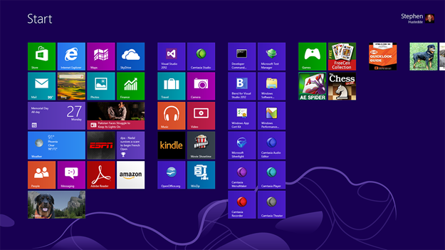
Figure 11 – The Windows 8 Start Screen.
Windows 8 Typography
Microsoft began using the Segoe UI family of fonts as its user interface font with the introduction of Windows Vista. The company continued its use in Windows 7 and now with Windows 8. The font family has taken a more prominent role in Windows 8 as apps conform to the UI Design Guidelines to utilize Segoe UI in the user interface of Windows Store apps. There are five versions of Segoe UI.
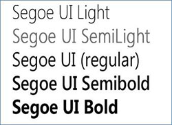
Figure 12 – The Segoe Font Family.
Microsoft introduced Cambria and Calibri fonts as default replacements for Times New Roman and Arial fonts in Office 2010. Both of these are utilized in typography standards for Windows Store apps. The Microsoft UI Design Guidelines specify certain typography rules based on the setting and context. Options include Segoe UI, Calibri, and Cambria.
For more details about best practices with fonts, read the "Guidelines for fonts (Windows Store apps)" on the Windows Dev Center – Windows Store Apps website.
TIP: Microsoft will not restrict acceptance of apps to the Windows Store if you use other fonts or if you use other sizes. The recommendations are in place to help you conform to Microsoft's intended design.
Design for Touch First
The Rise of Touch
Tablets are now outselling personal computers. The mobile device revolution has greatly influenced the state and future of both desktop and mobile computing. Touch-sensitive liquid crystal display monitors have greatly improved and decreased in price the past few years, making them a viable option for both personal and corporate environments. Will the computer mouse become an antiquated device? Perhaps. Children today who have grown up with the likes of an iPad are touch-oriented and mouse-resistant.
Windows 8 was designed around a touch-first philosophy. This perhaps was its greatest detractor as a desktop operating system for those relying on mouse input. Nevertheless, to design around a mouse-first philosophy might likely lead to Microsoft and their Windows operating system becoming outdated. As of this writing, Microsoft is planning a new release (version 8.1) that will make the OS more mouse friendly and appeal to those who want to predominantly work in the older desktop mode. But make no mistake—as you design apps for deployment via the Windows Store, you should design first for touch interactions. The mouse users will still be able to use your app, as there are mouse and keyboard equivalencies. When developing Windows 8 apps, you can code to lower level pointer events. Pointer events are device independent and accommodate the use of touch, mouse, keyboard, or stylus. However, higher level event gestures, such as click or tapped, will also handle most input devices including touch and mouse and pen. If you are looking for specific input settings such as the pressure level of a pen stylus, you can access the pressure property of the PointerPointProperties when using the pointer class. For examples in this lesson, you will predominantly use the Tapped event where you might have previously used click in building desktop applications.
The Touch Interactions
It is important to remember that touch targets are not as precise as mouse targets. They must be larger in size and devices can sometimes register a bit off. Touch interactions will not be pixel-level specific, and apps featuring precise drawing or illustration effects will still be best served as mouse-driven applications running in the desktop mode. Microsoft's guidelines are that targets should be at least 40 pixels square and that a padding of 10 pixels or more exist between targets. There are several types of touch interactions.
| Touch Interaction | Touch Methodology |
|---|---|
| Tap | Touch target briefly with a finger, then lift. This is the most typical interaction and is comparable to a mouse click. |
| Hold | Touch target and remain in place. This often is coded to bring up a context-sensitive menu or help. |
| Slide | Touch the screen at an edge and move across the screen. Sliding from the top edge toward the bottom edge of the screen closes the current app. Sliding from the top edge down and to the left or right edge snaps the current app to that side of the screen. |
| Swipe | A short slide across an object. A swipe is used to select an object. Swiping from edges can also access OS commands. Swiping from the right edge brings up the Charms bar and swiping from the left edge cycles through the open apps (similar to the traditional ALT+Tab operation). Swiping from the bottom or top edges reveals the app bar(s). |
| Pinch / Stretch | A two finger gesture used to zoom in or out. Pinching two fingers together zooms in while stretching two fingers apart zooms out. Pinching and stretching can also be utilized for Semantic Zoom. |
| Rotate | A two finger gesture in which two fingers are held on a target and rotated either clockwise or counterclockwise around a pivot point between them. |
| RightTap | A RightTapped event is triggered upon the release of a Holding event. |
For more details on designing for touch, see these Microsoft articles from the Windows Dev Center – Windows Store Apps website:
Accommodating Different Form Factors
Device Independence
Windows 8 was designed to provide similar experiences on all devices. An app should be equally usable on a tablet, laptop, or desktop. While the Windows 8 experience is very similar on phones, you can design apps specifically for the Windows Phone. These apps are marketed through the Windows Phone Store and are directed at accommodating the more limited screen size. This lesson focuses on designing for computers and tablets, but the principles translate easily to creating apps for Windows 8 smart phones as well.
You already learned about one key principle of designing for different form factors—utilizing independent user interactions—whether it be by mouse, keyboard, touch, or stylus. But there are other considerations. Different devices have different resolutions and Windows 8 apps fill the screen. Accordingly, it is important that apps be scalable and adaptable to different resolutions. Microsoft refers to this as fluidity and scalability. Microsoft provides templates and layouts in Visual Studio that accommodate this. While you can create static layouts, fluid layouts change size and reflow content to adapt to the available space on a device.
It is important to note that Windows Store apps will not run on devices with a resolution of less than 1024 x 768 pixels. The minimum resolution to support all the OS features, such as view states, is 1366 x 768. A resolution of 1366 x 68 is a good place to start designing.
Landscape First
Design first for landscape orientation. Tablet devices may rotate and use a portrait orientation, so it is okay to design for portrait orientation, but do so secondarily. You want to be inclusive of all users and computer displays are almost exclusively viewed in a landscape orientation. Your app should support both, but it is not required.
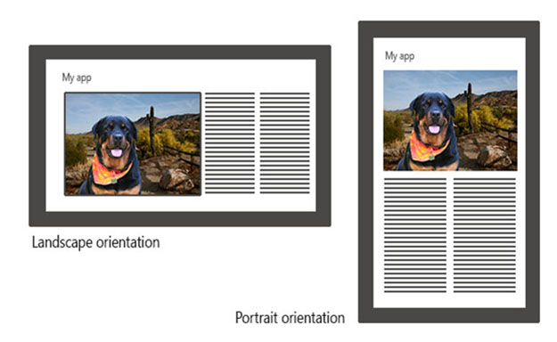
Figure 13 – Design for landscape orientation first, but do not forget about including a portrait orientation.
Design for Three View States
In Lesson 1, you learned that an app can be in one of three view states: full screen, filled, or snapped. Apps are predominantly designed to utilize the whole screen, which is the full state. Apps also can be side by side with another app. The app that takes the smaller area of the two is said to be in the snapped state, while the app that is displayed in the larger view is said to be in filled state. When designing an app, you want to design a layout that is fluid enough to accommodate all three states. Windows 8 OS will take care of switching between the three views.

Figure 14 – Design for all three view states.
For more information on designing for multiple devices, see these Microsoft articles from the Windows Dev Center – Windows Store Apps website:
- "Guidelines for window sizes and scaling to screens (Windows Store apps)"
- "Guidelines for resizing windows to tall and narrow layouts"
More Design Considerations
Designing App Bars
Use the App Bar feature of Windows 8 to provide commands and options to the user. The App Bar replaces the old menu-bar system and can be context sensitive. Be aware that there are specific guidelines for command placement and use of App Bars. Here are a few key rules:
- App Bars are context sensitive and should be designed for a particular page.
- Different command groups should be separated by a separator or grouped on left and right sides.
- New/Add/Create buttons (+ icon) should be on the far right.
- Accept, Yes, and OK commands should be placed to the left of Reject, No, or Cancel commands.
- Be consistent when placing commands that appear on multiple pages.
- If you use a horizontal scrollbar at the bottom of your app, be careful that it does not get covered up by the bottom App Bar if you utilize the sticky mode option in the App Bar; ensure the App Bar remains visible for multiple commands.
- Search commands and Settings options should not appear in the App Bar. Use the Charms Bar feature instead. Likewise, do not place a command to return to the Start Screen in your App Bar.
- Place mission-critical or page-navigations commands on the app page area rather than the App Bar.
For more information on designing App Bars, see the Microsoft article from the Windows Dev Center – Windows Store Apps website:
Scaling Graphics
Fluidity and scalability are important aspects of making Windows Store apps pertinent on all devices. While the XAML (Extensible Application Markup Language) elements (or controls) are built out of scalable vectors, external graphic images are one area that can be problematic. You want your app to look great on a 10" 1366x768 tablet as well as a 27" 2560x1440 desktop monitor. The recommendation is to use vector graphics (XAML graphic format) rather than bitmapped images (such as JPG or PNG formats) wherever possible. There are third-party, open-source tools for converting between SVG and XAML formats, such as inkscape.org, and open-source plugins for illustration software, such as Adobe Illustrator. See Michael Swanson's AI>XAML webpage for one example. An Internet search will provide other resources.
Excluding bitmapped images is not always feasible. Allowing Windows to scale a bitmap up will produce a jagged image. Scaling down, while better, can produce distracting artifacts. Microsoft recommends that three versions be included of any bitmap used in an app. Microsoft suggests scaling the images at 100%, 140%, 180%. High-end image manipulation programs such as Adobe Photoshop can do a decent job at scaling up. However, since scaling down usually produces better results, one recommendation is to start with a large image as the 180% bitmap and scales it down to 77.78% for the 140% image, and scale the original file to 55.56% to produce the 100% image. Whether you scale up or down, you will want to save the three images using the following naming conventions:
| Image Size | File Name | Alternatively use same filename for all three but place each in a subfolder named: |
|---|---|---|
| 100% (small) image | Filename.scale-100.jpg | ...\scale-100\Filename.jpg |
| 140% (medium) image | Filename.scale-140.jpg | ...\scale-140\Filename.jpg |
| 180% (large) image | Filename.scale-180.jpg | ...\scale-180\Filename.jpg |
For full screen bitmaps, you can target three sizes of 1366x768 (100%), 1920x1080 (140%), and 2560x1440 (180%).
For more information on scaling graphics, see the Microsoft article from the Windows Dev Center – Windows Store Apps website:
Watch the "APP:207: Windows UI Design" video (57:28) from Channel 9 and Nigel Parker at the New Zealand 2012 TechEd on the design of Windows Store apps.
Practice
- Explain to a classmate the features of Bauhaus and Swiss (International Typography) styles and how they are utilized in Windows 8.
- Demonstrate the different touch gestures to a classmate.
- In a small group of your classmates (3 or 4 people) discuss how the Bing News and Kindle apps conform to the Windows 8 design guidelines. Do they depart at all from the guidelines? If so, why do you think the designers chose to do that?
Assignments
Complete the following:
- Quiz
- Assignment 2A: Design Philosophy Presentation
- Assignment 2B: Touch Gestures Poster
- Assignment 2C: Evaluate the Design of Existing Apps
Summary
After reviewing the design guidelines for Windows 8 apps from Microsoft, it is evident that the emphasis has moved from user interface (UI) to user experience (UX). Design is not about conforming to standards (while still important), but is really about making an app that is great for people to use in the environment of Windows 8. Of course, that includes utilizing the consistency of the operating system design and the intuitiveness of its features.
Some hallmarks of the Windows 8 design are simplicity and reducing clutter. The concept of "less is more" was introduced in the Bauhaus and International Typographic (Swiss Design) styles. Simple, universal-like pictograms have replaced colorful icons. Typography is elegantly simple and easy to read, incorporating standards fonts of Segoe UI, Calibri, and Cambria with specified sizes and uses to maintain consistency. Type is recognized as playing an important role in design.
Touch screens are more prevalent in computing as the industry moves forward and Windows 8 apps are designed first and foremost to incorporate touch as a vital part of the user experience. It is important that touch targets be an appropriate size and that margins between targets are maintained. Touch gestures should be utilized over commands to perform functions wherever possible, such as rotating or resizing a control.
Designers should be aware of the design guidelines. Apps should be created for landscape orientation first, but in most cases should not exclude portrait orientation design as well. Apps should be designed for all three view states – full screen, filled, and snapped. An app and its components, including graphics, should be scalable to different devices. The app should utilize the OS standard features of the App Bar for context-sensitive commands and the Charms Bar for standard OS practices such as searching, sharing, or changing settings and options in the app.
For an overview of what you learned in this lesson, watch the first 24 of the "APP202: The Absolute Beginner's Guide To Building Windows 8 Apps" video from Channel 9 and Ben Gracewood and Ian Randall (1:01:28).
This work is created by the National Information Security and Geospatial Technologies Consortium (NISGTC), and except where otherwise noted, is licensed under the Creative Commons Attribution 3.0 Unported License
